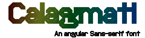
Calagmati is licensed under a CC-BY-ND 4.0 license, making it free to use for both personal and commercial usage. You may also re-distribute the font, provided that you do not alter the file or claim it as your own work.
The Universal Character Set (UCS for short) is divided up into 17 planes, with 65,536 codepoints each. The first plane is the Basic Multilingual Plane (BMP for short, plane 0), which contains a lot of characters that are used in today's living scripts and languages, and supported by every program that supports Unicode. Even in 2026, there are still a handful of programs and operating systems that do not support the other 16 planes.
Calagmati contains numerous scripts (some of these are still used today, but there wasn't enough room in the BMP; some are historical scripts that are no longer in primary use today (speaking of which, there are some historical scripts in the BMP, like Runic, Ogham, Coptic) and characters in the Supplementary Multilingual Plane (SMP for short, plane 1). Whether these are displayed or not depends on the rendering program, your operating system, and any fonts you have installed, as well as the font linking.
For the first test, look at this character:
𝕮In general, it's difficult at first to predict whether these characters will display correctly in software or not. You will have to test that yourself.
Calagmati contains a number of scripts that are written from right-to-left. These scripts are: Hebrew, Phoenician, Hatran, Sidetic, Imperial Aramaic.
To test this support, look at the following samples:
עבריתThe left most characters from top to bottom should be: "ת", "𐤍", "𐣭", "", "𐡕", "𐡶", "𐢞", "𐤳", "𐩵", "𐪕", "𐰜". If not, then your browser does not handle some or all of these scripts correctly.
Calagmati includes a number of OpenType features. This section lists out the features that the font uses. Not every browser supports these.
Calagmati uses three stylistic sets for the single story a and g, and the curled t. It is like that so users can pick and choose which features the user needs.
Normal: Calagmati
Alt. A: Calagmati
Alt. G: Calagmati
Alt. T: Calagmati
All: Calagmati
Calagmati uses .rlig for the Armenian letters with abbreviation mark above and Old Turkic Ci, dlig for Palmyrene, and .ccmp for tone contours and Variation Selectors (the latter is defined via format14 as well).
This character is rarely used if at all with modern Armenian, but old Armenian uses it.
ամ՟The ՟ should be positioned above the մ.
This ligature appears to have been used once, most likely when whoever engraved the word 𐰚𐰠𐱅𐰲𐰃𐰢𐰕 forgotten the letter 𐰃, and tried to correct that.
𐰲𐰃This should appear as a single character. (You need to use the ZWJ as non-ligated 𐰲𐰃's appeared in Old Turkic)
The use of ligatures in Palmyrene depended on the style of the script.
𐡧𐡴The 𐡧 should be connected to the 𐡴.
The left characters should be touching the rim, while the right characters should be separate from the rim.
Calagmati mainly uses this feature for Old Italic as some languages that used this script used it going from right-to-left.
Left-to-right: 𐌌𐌄𐌊𐌇 𐌓𐌀𐌔𐌍𐌀𐌋
Right-to-left: 𐌌𐌄𐌊𐌇 𐌓𐌀𐌔𐌍𐌀𐌋
The text on the bottom should be flipped horizontally from the text on the top.
Calagmati mainly uses this feature for the Ancient Arabian scripts as these scripts were sometimes used going from left-to-right.
Southern:
Right-to-left: 𐩣𐩯𐩬𐩵
Left-to-right: 𐩣𐩯𐩬𐩵
Northern:
Right-to-left: 𐪃𐪏𐪌𐪕
Left-to-right: 𐪃𐪏𐪌𐪕
The text on the bottom should be flipped horizontally from the text on the top for each.
Kerning is the adjustment of the spacing between two specific characters. For example, in the sequence “LT”, the L and T are commonly moved closer together than the L and O in “LO”, because their lettershapes making the spacing look larger. Characters with such adjustments are called kern pairs, and they can be defined within both TrueType and OpenType fonts.
Despite the very large number of characters, Calagmati supports kerning for the major European languages in the Latin, Greek, and Cyrillic scripts. Other scripts and characters are not kerned as there is a very large amount of them. For example, A Unicode font provides kerning for L and T also needing to handle ĹĻĽĿȽḶḸḺḼ… and ŢŤŦƬƮȚȾṪṬṮṰ…. With so many characters, this can add thousands of pairs, with the ratio of effort vs benefit being of concern.
Hinting is a form of technology inside the Truetype format used to adjust the outlines of glyphs in a font to the pixel grid of a computer screen. It's like an assembler language, and hinting instructions need to be defined for every single glyph at every font size (at least for small font sizes. There are tools to automatically do this, but every result I gottem with them was either difficult to read or looked ugly. For this very reason, Calagmati is not hinted.
Because of this, Calagmati might look more blurry on computer screens than other fonts. It has no effect on printers because they have higher resolutions then screens do and doesn't even make use of hinting anyways.
If and how much Calagmati looks blurry depends on your system and rendering program. As Anti-aliasing, subpixel rendering, and auto hinting algorithms gets more sophisticated, the problem with lack of manual hinting becomes less imprtant over time.
Calagmati looks fairly readable in most rendering programs at usual font sizes 9px and above, and I don't have time to manually hint more than 10,000 characters. For this readon, hinting is not planned in the foreseeable future, and Calagmati will most likely never contain hinting.
If a version indicator of Calagmati is shown here, then that is the version you have installed. If it shows a version indicator of another font, or another symbol, then it is either likely that: